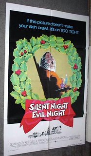
For instance, in a recent comment, a supercool reader pointed me to Ain't it Cool News, where there's a comparison of the posters for both the original Black Christmas and the upcoming remake. I've brought the images home to roost for discussion, thanks to the power of The Internet. Let us begin with the poster for the original movie, this one in particular is sporting one of the film's alternate titles:
 OK, alright. Nothing terribly spectacular, but nothing terribly awful, either. The corpse with a bag is probably the most enduring image from the film, so it's fitting to use it here. I like the tagline...it's so so 70s, when, instead of trying to be a cool catchphrase, taglines tried to convince you that films were shocking and terrifying (see also: Last House on the Left, The Texas Chainsaw Massacre). Nowadays there's no real pizzazz, you know? It's like..."Evil has a new face!", which just makes me think, "Well, good for evil! How nice."
Now then, on to the poster for the remake. Before I put it up here, let me just say that I have Flintstones Chewable Dial-Up Internet Service here. Yes, I know...how very 20th century of me. The reason this matters is, I read the copy on Ain't It Cool before the image loaded and I was led to believe by the praise therein that the poster would be...well...not what I think...anyway, look at it, will you?
 What. The fuck. IS THAT? I'm not just being prejudicial against the remake, I swear. I have the highest hopes for every single horror movie that emerges on screens both large and small, honestly, no matter what. But that, my friends...that poster is a piece of brightly colored crap. I really hate to get my nerd on like this, but that fucking font used on the tagline drives me nuts. Who decided to use some fucking KidPrintScriptBullShit facsimile from Microsoft Fucking Word on a horror movie poster? I see no reason to ever use such a whimsical font, least of all on a horror movie poster.
Now then, the image itself. Is that a dead person? Is that someone hiding from someone else, being scared? Is someone waiting under the fucking fiber optics to see if Santa will really come to snack on the cookies and milk? I have no idea. It's pretty damn reminiscent of the poster for the remake of The Hills Have Eyes, an image which I also thought was terrible. It could have maybe been ok, but the girl pinned down looks decidedly unterrified. Maybe they're just reusing the same bland girl head over and over again with different toppings for different movies. Now it's a hand! Now it's fiber optics! Use it again for the Halloween remake, but be sure to use a pumpkin!
Is the remake officially being called "Black Xmas"? I guess that red "x" means something bad will happen during the movie, but frankly it just makes me assume I should watch the movie whilst drinking a Mountain Dew and doing a goofy foot ollie kickflip on my board. How hip!
Ah, Mondays.


No comments:
Post a Comment